Parents aren’t babies, and “cute” isn’t a design strategy

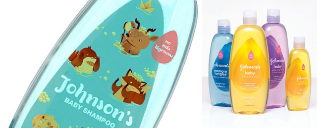
JohnsonandBabyThis recent post on thedieline.com, containing ideas for the Johnson’s baby packaging from a Peruvian designer, is really disturbing. Let me count the ways.

First let’s start with full disclosure. We will be forever thankful that Johnson & Johnson was one of our founding clients at The Shear Partnership 20 years ago when we opened the doors in 1993. And we know a bit about this brand. In fact we designed the current global Johnson & Johnson baby packaging system (shown on the right in the image above). So lets talk about why this post is so wrong.

1. First and most importantly, this is an iconic global brand. It has a strong visual equity that is composed of just a few simple, but strategically optimized, visual elements. You don’t mess with this equity with silly illustrations, or amateurish logo typography. This is a brand with billions of dollars in annual sales.

2. Decoration, purely for its own sake, is not a brand strategy.

3. Parents buy baby stuff, not babies. It has been proven that they don’t necessarily, or instinctively, respond to visuals that are intended to be ”babyish”.

4. This brand should not be trivialized by “cute”. Making an investment in an illustration style on an iconic brand like this is a significant risk. It becomes a reflection of the brand. The symbiotic relationship between brand and support visuals is key and must be weighed very carefully.

5. And what’s with that horrendous piece of logo typography?

Lastly, featuring this kind of project on thedieline.com trivializes their brand, cheapens the work of the marketers at Johnson & Johnson, weakens the importance of real strategic design thinking on iconic consumer brands, and just feels dirty.

The list is long, I could go on, but won’t.

Sorry Andrew, I post this only because thedieline.com has become a respected and indispensable package design resource. Am I overreacting? If I am just let me know.

Posted in Design Criticism, Design Practice | Tagged , , , , , , , , | 5 Comments

The tail end of technology, and how we choose

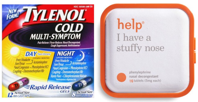
Tylenol and HelpWe are in the midst of a very rough flu season in the New York area, and lots of suffering people are wandering the drug store aisles in search of relief. These days it comes in many forms.

But apparently the way we make choices, including for cold remedies, is evolving. With more concern about how it makes us feel and less about what’s inside the pill.

For instance, the last time you bought a car did you lift the hood and discuss valve timing with the salesperson, or when you bought your last piece of mobile technology did you ask how many megahertz the device operates at, or when you bought that box of Tylenol did you care whether it was loaded with plenty of Chlorpheniramine Maleate? Well I didn’t, and it turns out we may have design to blame.

As an article in the today’s NY Times’ Bits column, written by Nick Bilton points out, we care less and less about the mysterious technology of the things we buy and more about the experience of using objects and yes their design. Certainly the image above demonstrates that point clearly. For me the Help Remedies package makes the decision really easy, Tylenol makes it really hard.

As John Maeda, President of the Rhode Island School of Design points out in the piece, “We’re on the tail end of technology being special. The automobile was a weird alien technology when it first debuted, then, after a while, it evolved and designers stepped in to add value to it.”

I would suggest that there are a host a consumer product areas that are also on the tail end of technology, where consumers simply don’t care about the stuff that’s in the product as much as how it makes them feel. Some marketers are catching on.

Posted in Design Criticism, Design Practice | Tagged , , , , , , , | Leave a comment

The Last Coca Cola

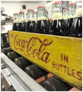
The last glass returnable bottle of Coca Cola ran off the line on Tuesday. And was immediately sold to a collector for $2,000.

That bottle, cast for the Minneapolis Coke bottling works in 1948 and filled at the Winona Coca-Cola Bottling Co., was the last 6.5-ounce glass returnable bottle of Coca-Cola filled and capped in the United States.

This beloved and iconic Coke bottle was the product of a 1915 design competition won by the Root Glass Company of Terra Haute Indiana. This design was unique and produced a practical bottle shape that could be instantly identified, even in pitch darkness, solely by feel.

So distinctive was the design it was both patented and trademarked. And so successful that for the next 40 years – until 1955 – the only way you could buy a Coca-Cola was in the 6.5-ounce returnable bottle or in a glass as a fountain drink. In 1955, King-sized Coke was introduced, in returnable 10, 12, and 26 ounce Family Size bottles. Coke in cans was introduced in 1960.

Here is more background from the Winona Daily News.

Posted in Beverages, Design Criticism, Environmental Packaging, Packages Yesterday | Tagged , , , , , , , , | 1 Comment

E*Trade finds a new use for packaging

So you think product packages in the aisles of Target or CVS are just for shopping, think again.

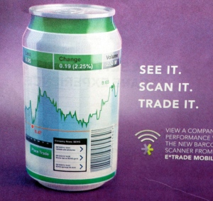
Now you can check out investment information on publicly traded companies while wandering through the store.

Or while sitting in your kitchen eating your breakfast cereal, you could get information on Kellogg’s. Or having a beer while watching the game, why not get information on AB Inbev.

This new app from E*Trade lets you scan the UPC code on a package and view a company’s performance with their new barcode scanner. Sounds great!

It’s another fascinating example of the power of mobile technology, combining the retail package, bar code scanning, and your cell phone.

Posted in Design Criticism, Packaging Technology, Retail Technology | Tagged , , , , , , , , , | 2 Comments

Absolut Unique, Gutenberg would be proud

In 1440 Guttenberg celebrated moveable type, in 2012 Absolut Vodka celebrates moveable design!

It only took 572 years for the folks at Absolut to find a way to go beyond the holy grail of the printing and design industries . . . the notion of exactly identical printed objects.

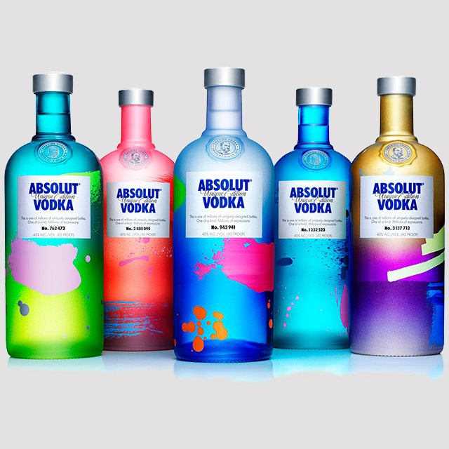
With the recently announced Absolut Unique package design project, the brand is creating 4 million unique bottles, each with a different, and random, brightly colored background pattern that is applied to the glass during the decoration process. And each label is also uniquely numbered, making the 4 million bottles truly one of a kind. Below is a short video showing the production process.

Last night was the first night of the semester at my SVA Masters in Branding class. And this class was focused on the notion that printing and printed objects from the 15th and 16th centuries, represented the very first use of technology that allowed for the wide distribution of cultural information and ideas. These objects like books, wall coverings, decorative prints, and maps . . . available for the very first time, really were the earliest objects setting the stage for a common set of cultural and aesthetic values, and then eventually brand creation in later centuries.

It’s really exciting to see printing technology come full circle and allow for the creation of uniquely crafted brand solutions. As I said . . . Guttenberg would be proud.

Finally, in the interests of full disclosure, I am proud to say that Pernod Ricard is a client. And they should be deeply proud of this program.

Here is an Ad Age article that gives a bit more detail.

Posted in Beverages, Design Criticism, Packages Today, Wine, Beer, & Spirits | Tagged , , , , , , , | 1 Comment

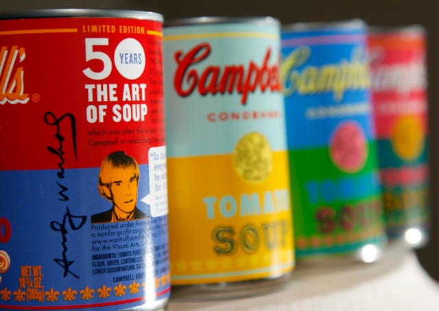
Andy Warhol, Target, and new Campbell’s Soup cans

50 years ago this month, Andy Warhol began his life-long exploration of the boundary between art and commerce (as if there ever was one), with the exhibition of “32 Campbell’s Soup Cans” at the Ferus Gallery in Los Angeles.

In previous posts I have written about this exhibition, the Dennis Hopper purchase, and my meeting with Andy in Paul Stuart’s changing room.

And in an act that further blurs this boundary, and celebrates this anniversary, on Sunday September 2nd Target will begin selling new multi-colored reproductions of Andy’s Campbell’s Tomato soup cans. These 1.2 million cans will come in four color combinations and cost 75 cents each.

This great work was designed by Deutsch Design Works in San Francisco.

Campbell’s has created promotional cans twice before, at Giant Eagle in 2004 and at Barney’s in 2006. I think Andy would approve.

Here is a link to the USA Today piece on this promotion.

Posted in Design Criticism, Design Practice, Food, Packages Yesterday | Tagged , , , , , , , | 2 Comments

The Image of Christ and Goldenberg’s Peanut Chews

This week, two articles in the NY Times caught my attention. The first was about the image of a candy package, the second about the image of Christ, and both are lessons about good intentions gone really bad.

And while one is the story of a botched restoration of a religious icon in the Spanish town of Borja, and the other about the botched update of a Philly icon, only time will tell whether these stories will end as intriguing examples of resurrection.

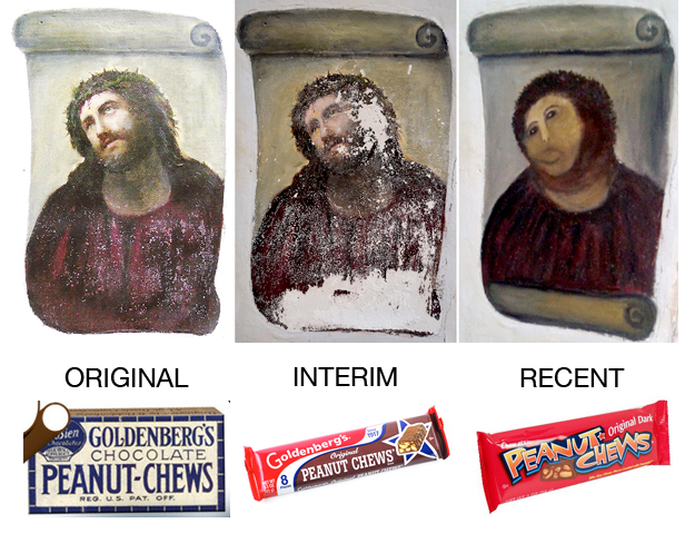
The first article, about Goldenberg’s Peanut Chews, initially got my notice simply because it was in the NY Times Advertising column, a place not known to spend much time talking about package design. The story begins with the classic tale of a brand, started in the early 20th century, seriously threatened by departing from its heritage when purchased a few years ago by the Just Born candy company. And then describes the brand’s recent renewal with the adoption of a new package design and communication strategy that returns to familiar and iconic brand identity “roots”.

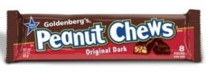
Hey, this new package (shown below) may not be perfect, but it certainly pays homage to the brand’s retro mid-century influences, rather than the over-the-top, amped, and meaningless typography so popular in the early 2000s.

The prodigal brand losing its way with extravagant overindulgence, or simply a misplaced restoration, and then returning to its former glory only with a return to its simple roots, is always a brand identity theme that gets my attention. We focus on these kinds of stories in my class on the origin and evolution of consumer brands at the School of Visual Arts.

The second article, about the desecration of a religious icon, the fresco of Christ painted by Elias Garcia Martinez in the 19th century, is also a tale of the misguided but perhaps well-meaning update of a classic image . . . in this case apparently by Cecilia Giménez, an elderly congregant of the Santuario de la Misericordia. She apparently got upset watching the fresco degrade on the walls of the cathedral and took matters into her own hands. The results of which you see in the image above.

This sounds like the classic story of many innocent or misguided marketers who mistake change for progress, and take the evolution of brand equity into their own unprepared and/or unsympathetic hands.

The good news is that both of these icons are now in the hands of professionals, who have their best interests at heart, and the ability to restore their heritage and meaning.

Posted in Architecture, Candy, Design Criticism, Design Practice, Packages in Art, SVA Masters in Branding | Tagged , , , , , , , | 20 Comments

IBM, Google, Augmented Reality and a Retail Revolution

My sense is that 2012 will be remembered as the transition from the second wave of mass retailing to the third wave.

And some retailer is about to step up and own it, by creating a truly new retail format based on the evolving technology being pioneered by Google, IBM and others. And with this change in retailing will come a radical redefinition of the role of the retail package as the singular representative of the brand in store, a role it has owned for 150 years.

We are now living in a time much like 1859, the year A&P launched the first wave of mass-retailing with the concept of a chain food market, and like 1916 the beginning of the second wave, when Piggly Wiggly took that concept and made it self service.

Smart retailers are now experimenting with technology that will allow them to become the A&P or Piggly Wiggly of the 21st century, by evolving the retail experience from assisted retailing, to self-service retailing to . . . I don’t know . . . lets call it cloud-based retailing.
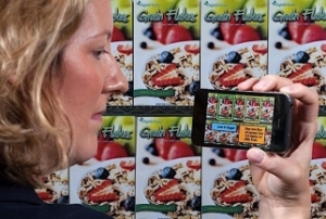
About three years ago I began discussing Augmented Reality (AR) and the transformational influence it will have on retail brands, packaging and the shopping experience, when learning about early tools like SixthSense (an early version of a device developed at MIT Media Lab with Google glasses-like capabilities), Wikitude, Yelp, and Scanlife.

Since then we have reached a point where QR codes have become ubiquitous and frankly passé, from the shelves of Target, to the pages of every newspaper and magazine, to the walls of a subway car. Retailers are now experimenting with the next generation of retail AR platforms. And two recent pieces, one in Ad Age Digital and one in the NY Times Bits column, begin to hint at the next steps.

The Ad Age Digital piece, written by Jack Neff, talks about an IBM technology that will take the retail experience far beyond the traditional one-to-one relationship between the shopper and the package. As John Kennedy, VP Corporate Marketing, describes,

“You specify the things you’re interested in, and then using your device and the video camera on the device, as you scan the product the app will recognize it and superimpose the information you’re looking for on the product itself . . . (the app) marries the wealth of information on the web so the shopping experience becomes more informative and personal to help them make better decisions. It opens questions about what can happen in the relationship between the retailer and shopper and ultimately the (brand) marketer.”

The NY Times Bits piece, written by Nick Bilton, talks about the way ideas have been communicated from Gutenberg and Aldus Manutius to Sergey Brin and Google’s Project Glass. A technology that is likely to be very similar to what IBM and its retail clients are exploring. His point is that “When technology gets out of the way, we are liberated from it. Wearable computing will free us from peering at life through a 4-inch screen.”

At retail, and soon by the looks, we will no longer be limited to peering at a brand through a bag, or box or can. These new forms of retail experiences led by AR will free us from the package as the sole brand storyteller in-store. Our retail experience of the brand will be transformed by in-store media that goes far beyond just the physical package. And when the package is not the sole communicator of the brand, it will lead package designers and their clients to redefine the future role of a package.

Obvious questions come to mind.

For designers
What should a package look like in a third wave retail environment?

For marketers
What does a package say about a brand when so much is being said by the AR platform?

For Retailers
How do I display a package or create an environment that supports a connected shopper?

For regulators
What must continue to be communicated, by law, on the package?

Sounds like we have some thinking to do!
Posted in Design Criticism, Design Practice, Packages Tomorrow, Packages Yesterday, Packaging Technology, Retail Technology | Tagged , , , , , , , , , | Leave a comment

Estroven, Relief Reimagined

iHealth, Inc., a division of DSM Nutritional Products, is a consumer health and wellness company that recently asked us to reimagine the shelf presence of Estroven, the number one selling brand of OTC products for the relief of menopausal symptoms. In support of a newly defined brand equity, that was both feminine and efficacious, the new identity was created to clearly communicate both the functional and emotional benefit characteristics.

The old package was typical of the nutritional supplement category dominated by either generic natural cues or sterile medicinal heritage. Our intent was to create an approachable woman’s health brand with an honest simplicity and clarity of message.

The new package design system has been launched, with enthusiastic retailer response, in the mass, drug, and natural channels. It is supported by a redesigned website.

Posted in Beauty & Personal Care, Design Criticism | Tagged , , , , , , , | Leave a comment

Dee Dee’s Dieline Discussion on Co-Creation

Just back from the Dieline Conference, and again amazed at what Andrew Gibbs has accomplished in a few short years. The number one global package design resource with 3.5 million hits a month! Yikes!

On Sunday Dee Dee Gordon, President of Innovation at Sterling Brands, gave an interesting talk about the work she is doing with the consumer. She called it “Breaking Down Walls: Co-Creation with Consumers”. Her tool is a global consumer panel called the Callaboratory.

And just for the Dieline audience she polled her group and asked them what they thought were current trend influencers of package design around the world. Here are their 7 top issues.

  1. Excess is Out
    Consumers are looking for understated simplicity, want the product not package to shine, and feel comfortable with a clean minimalist approach to structure.
  2. Going Global
    Design influences are coming from all cultures, both traditional and new hybrid mixes of new and old from all over the world
  3. Hand Crafted
    Consumers are looking for the small indulgences that are implied with packaging and brands that take the time to present carefully crafted packages.
  4. Haptic Packages
    We are talking texture, surface details, raw papers, letter press printing, stickers, embossed glass, and the surface details and contrast between the package and product.
  5. More Than Green
    The package materials need to be more than environmentally responsible, the brand itself needs to stand for something and be making a proactive difference.
  6. Beauty
    The package is playing a larger role in the home environment, out on display in the bath or bedroom, not hidden in the cabinet or thrown away. It therefore must be a considered part of a person’s life.
  7. Everything is Mobile
    Its not just about the home anymore. Streamlined, with portable options, packaging must support the active lifestyle of many consumers.
Posted in Design Criticism, Design Practice, Environmental Packaging, Packages Today | Tagged , , , , , , , , , | Leave a comment