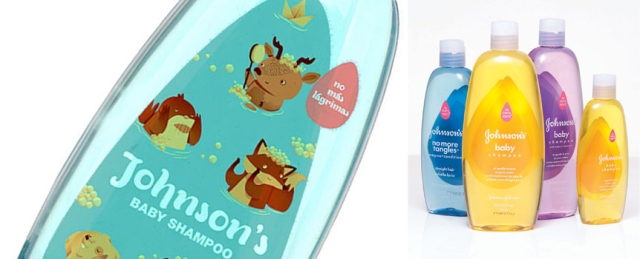
 This recent post on thedieline.com, containing ideas for the Johnson’s baby packaging from a Peruvian designer, is really disturbing. Let me count the ways.
First let’s start with full disclosure. We will be forever thankful that Johnson & Johnson was one of our founding clients at The Shear Partnership 20 years ago when we opened the doors in 1993. And we know a bit about this brand. In fact we designed the current global Johnson & Johnson baby packaging system (shown on the right in the image above). So lets talk about why this post is so wrong.
1. First and most importantly, this is an iconic global brand. It has a strong visual equity that is composed of just a few simple, but strategically optimized, visual elements. You don’t mess with this equity with silly illustrations, or amateurish logo typography. This is a brand with billions of dollars in annual sales.
2. Decoration, purely for its own sake, is not a brand strategy.
3. Parents buy baby stuff, not babies. It has been proven that they don’t necessarily, or instinctively, respond to visuals that are intended to be ”babyish”.
4. This brand should not be trivialized by “cute”. Making an investment in an illustration style on an iconic brand like this is a significant risk. It becomes a reflection of the brand. The symbiotic relationship between brand and support visuals is key and must be weighed very carefully.
5. And what’s with that horrendous piece of logo typography?
Lastly, featuring this kind of project on thedieline.com trivializes their brand, cheapens the work of the marketers at Johnson & Johnson, weakens the importance of real strategic design thinking on iconic consumer brands, and just feels dirty.
The list is long, I could go on, but won’t.
Sorry Andrew, I post this only because thedieline.com has become a respected and indispensable package design resource. Am I overreacting? If I am just let me know.


Richard, you’re spot on!
couldn’t agree more!!!
That typography is pretty poor. I think it’d be good enough if they just used the standard J&J font for that.
Dieline is a great inspirational resource. It just seems like these designers never have a budget.
Obviously student concepts don’t.
Also, do some research on the ingredients of that product. Ick.
Well said, Richard.